Put a twelfth-century Bible beside a fifteenth-century book of hours and the difference feels obvious at arm's length. Ask someone to explain it, though, and the words go vague: the Gothic one looks, well, more Gothic. That is because the two styles leave very specific fingerprints — in the shape of the letters, the way cloth falls over a shoulder, the colour of the ground behind a saint. Learn five or six of those fingerprints and you can place a page within a generation or two without ever reading the caption.
Begin with the script, not the picture
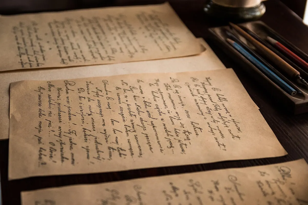
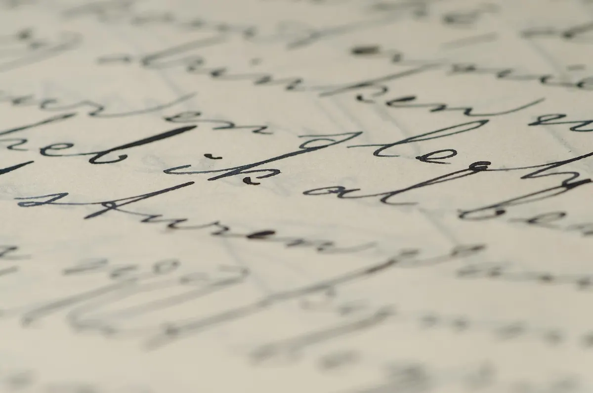
The fastest test is the writing itself. Romanesque scribes worked in a rounded, upright minuscule descended from Caroline script: letters sit well apart, the minims are distinct, and the page breathes. Look for generous spacing, few abbreviations, and text often running in a single wide column or two comfortable ones.
Gothic scribes wrote textualis — blackletter. The pen was cut at a sharper angle, so strokes turn angular and vertical, letters compress, and minims crowd together into picket fences. The tell-tale detail is the feet: small horizontal serifs at the base of each stroke, made by the angled nib. Text splits into two tight columns, abbreviations multiply (parchment was expensive), and a page of Gothic text reads as a dense grey texture rather than a line of separate shapes.
Material follows the same curve. Romanesque parchment tends to be thicker and less evenly finished, sometimes with visible hair follicles or a patch where a scribe worked around a flaw. Gothic parchment is thinner, whiter and more carefully prepared, and by the later Middle Ages you will occasionally find paper in ordinary working books.
How figures stand, bend and fall
Romanesque bodies are built from line. Drapery is a pattern of loops, zigzags and nested V-folds that describes the idea of cloth rather than cloth over a body. Figures are often elongated, feet point downward at odd angles, and faces use a small repertoire — almond eyes, a long nose, a tiny mouth. Emotion arrives through gesture: a raised hand, a turned head, a pointing finger. There is little interest in weight or volume.
Gothic figures move. They sway in a soft S-curve, lean toward one another, turn three-quarters away, gather their robes in a hand. Drapery now hangs from the body's actual points — shoulder, elbow, knee — with folds that bunch and shadow where the cloth is compressed. Faces gain chins, cheekbones, wrinkles and tears. By about 1400, artists are clearly watching real people rather than copying a pattern book, and the best of them can make a crowd feel like a crowd.
Colour, gold and the ground behind the scene
Romanesque colour is bold and flat: vermilion red, a strong blue, green, yellow ochre, plenty of white. Pigments sit in blocks with little shading, and backgrounds are often plain parchment, banded colour, or a simple gold field. The effect is heraldic and unmistakable.
Gothic pages glitter. Gold leaf is laid on a gesso ground, burnished to a mirror, then tooled with punchwork or a diaper pattern of tiny motifs. Early Gothic likes an all-over patterned gold background; later work uses gold more sparingly and lets landscape, sky or architecture take over. The palette widens too — pinks, oranges, olive greens, mixed tints, and modelling that suggests light falling from one side.
The initial, the border, and everything in the margins
Romanesque decoration is dominated by the initial, which can swallow an entire page. Letters are monumental, built from interlace and foliage, and frequently inhabited: the body of the letter is a dragon, a lion or a wrestler, with the text threading through it.
Gothic initials tend to be smaller and narrative — a historiated initial enclosing a scene, set on a gold ground. The real Gothic signature, though, is the border. It begins as a simple bar, then sprouts curling rinceaux, acanthus leaves, birds, hybrids and grotesques, until the whole frame teems with hunting hares, jousting snails and musicians. The Luttrell Psalter, made in East Anglia in the 1320s and 1330s, is the famous extreme, but the habit is everywhere in fourteenth-century books.
Regional accents matter as much as dates
Neither style was uniform, and place often explains more than century.
England
The Winchester Bible and the Bury Bible show Romanesque England at its most ambitious, with gigantic initials and Byzantine-influenced figures. In the Gothic period, East Anglian workshops produced psalters with extraordinarily rich marginal life.
France
Cistercian houses kept Romanesque illumination deliberately austere. Gothic France is another world: Paris becomes the great centre, Jean Pucelle's work in the 1320s and 1330s pushes toward small-scale realism, and the Limbourg brothers' Très Riches Heures crowns the courtly tradition around 1412–16.
Germany and the Rhineland
Ottonian and Romanesque workshops favoured glowing gold grounds and heavy, expressive figures. Later Rhenish and Cologne books show Gothic forms filtered through a local love of strong colour.
Italy
Italy never fully surrendered to Gothic. Bolognese workshops turned out legal manuscripts with their own crisp, classicising figure style, and Italian painters kept one eye on Byzantine models long after northern artists had moved on.
Spain
The Beatus commentaries on the Apocalypse, copied and illustrated across centuries, produce a Romanesque look unlike anything north of the Pyrenees — flat, brilliant and strange.
A field guide you can use in ten seconds
- Script: round, spaced, few abbreviations — Romanesque. Angular, compressed, two columns, feet on the strokes — Gothic.
- Drapery: pattern and loops — Romanesque. Weight, folds and shadow — Gothic.
- Background: flat colour or plain parchment — Romanesque. Tooled gold or patterned ground — Gothic.
- Border: absent or negligible — Romanesque. Flourishing frame with creatures — Gothic.
- Date: roughly 1000–1200 — Romanesque. Roughly 1200–1500 — Gothic.
Treat those dates as a rough map, not a fence. Styles overlap for decades, and a provincial Gothic workshop in 1250 can look more old-fashioned than a forward-thinking Romanesque one in 1180.
How to practise
Pick a single feature and hunt for it. Spend an afternoon looking only at initials; another day, only at how cloth falls. Whenever you meet a manuscript you do not know, cover the label, write down three observations, then check. You will be wrong sometimes — everyone is — but the errors teach you where the regional quirks live. The major national libraries and the Morgan Library and Getty have large digitised collections you can browse for free, and the more pages you scroll past, the faster the eye learns. Within a few months, a photograph of a single leaf will tell you when and roughly where it was made.
Photo: Andrys / Pixabay